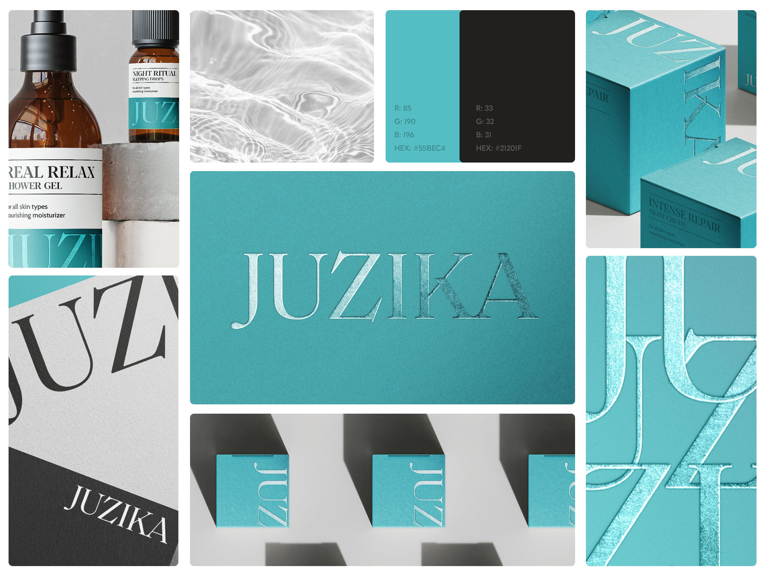
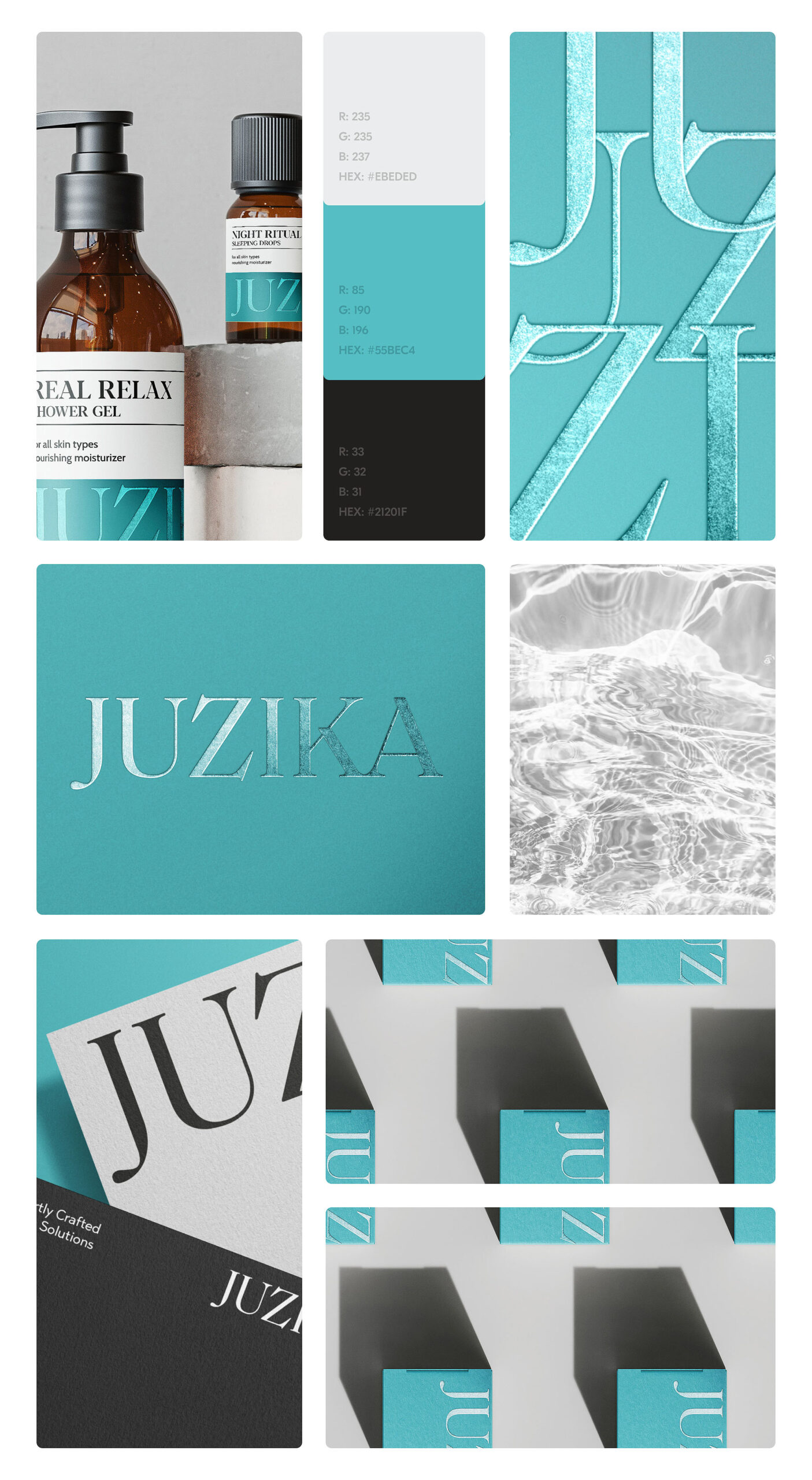
Juzika, a distinguished beauty brand that places its emphasis on the epitome of luxury skincare treatments. Their entire product line is meticulously crafted using nothing but the finest organic ingredients. This dedication to purity ensures that every Juzika product not only revitalizes the skin but also provides a refreshing and invigorating experience.
My Mission
When I first took on this project, packaging design wasn’t something I had extensive experience in. However, I viewed it as a great challenge.
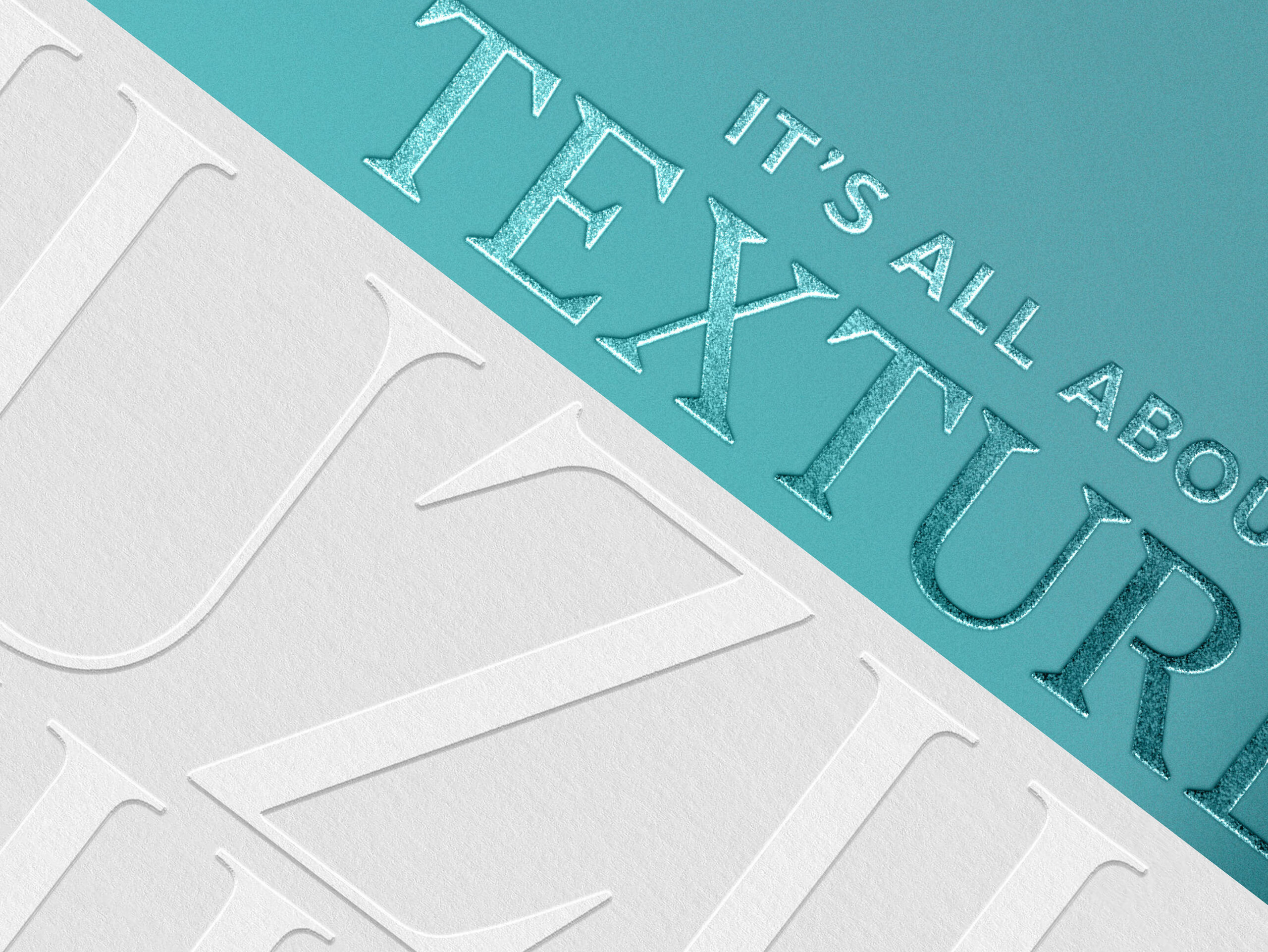
I also knew that I wanted to explore a variety of textures in this project. Just like in skincare, where different layers come together to create a beautiful result, I believed that combining various textures would be the secret to crafting the perfect design.
Client's Vision
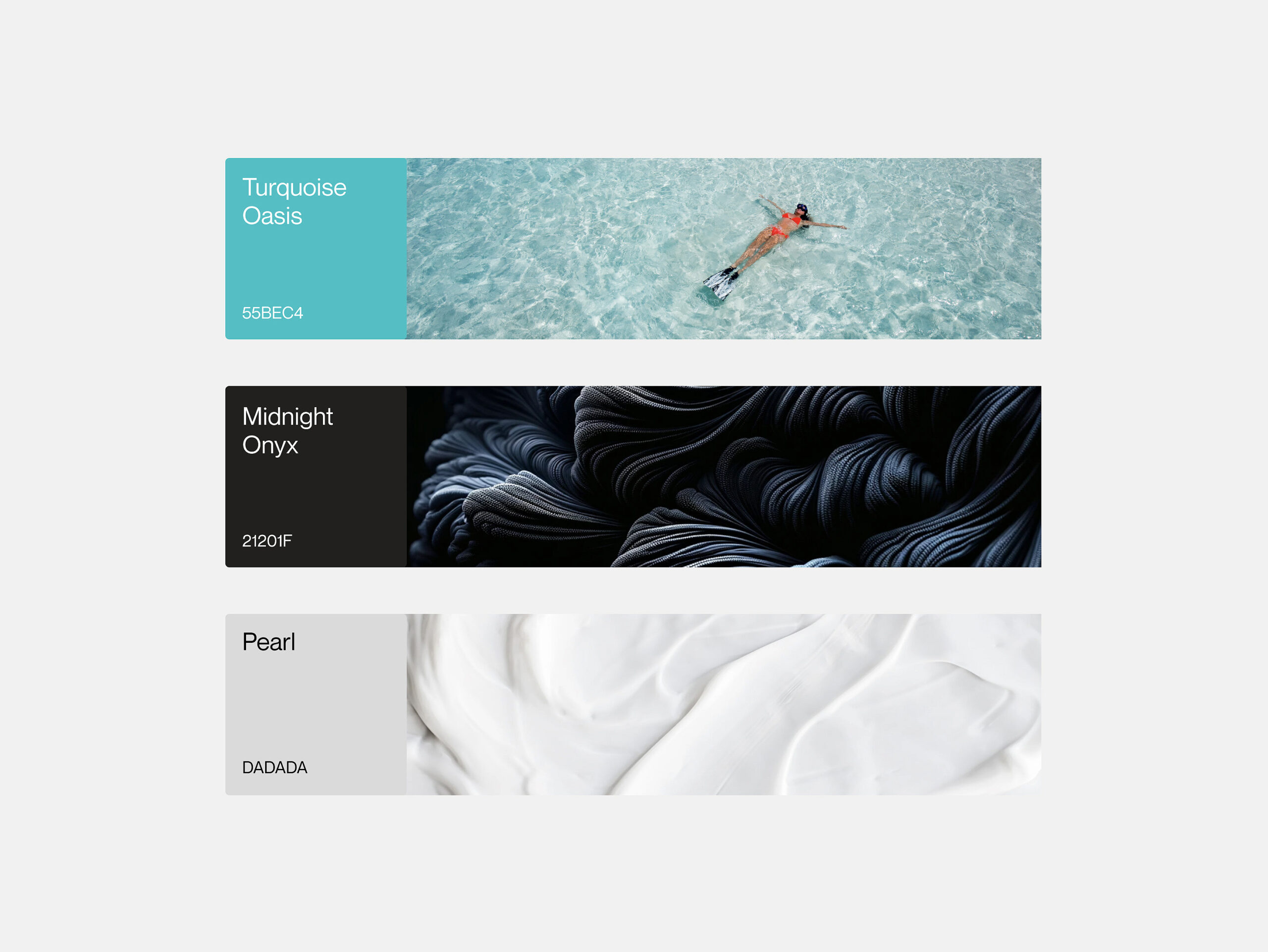
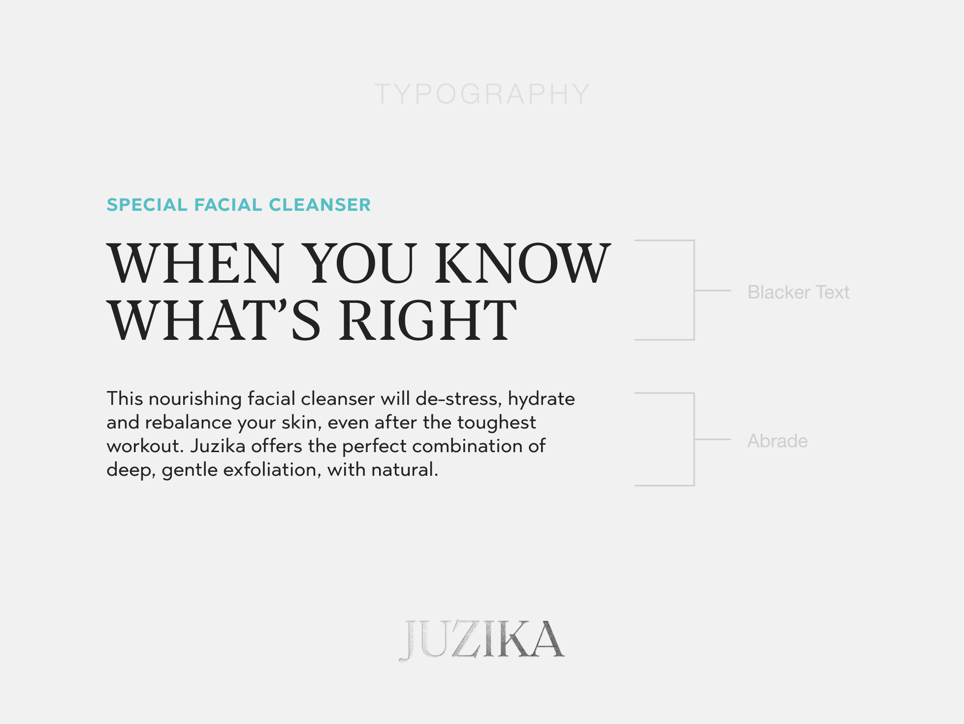
The client’s sole request was to maintain the turquoise color and infuse the entire brand with a sense of freshness.
In crafting this logo, I opted for a custom font that drew clear inspiration from the main heading font.
The entire creative journey revolved around two key objectives: infusing the design with a refreshing feeling while also evoking a profound sense of luxury.
things that i learned
One of the key takeaways from this project was the challenge of working with textures. I quickly realized that my Photoshop skills had their limits for the ambitious work I had in mind. To tackle this, I delved into countless YouTube tutorials.
This project turned out to be a great learning experience, especially in the art of crafting textures from scratch and using them effectively in real-world projects.
I absolutely love how this project came together; it’s actually one of my personal favourites.